Strangers and Struggles in a New World
16 May 2025
A recent report by the Swedish Association of University Teachers and Researchers echoes a reality I know all too well. As a PhD student and early-stage researcher in Poland, the quality of life issues raised in the study feel painfully familiar. What I once imagined as a calm and inspiring academic journey quickly unraveled into a bureaucratic labyrinth—and the nightmare began as early as the first week. The difficulty of securing the right to stay in Poland, particularly due to the scarcity of available appointment slots for a temporary residence permit, continues to be an uphill battle. Unlike EU citizens who navigate a more streamlined process, I am left with an inefficient, disheartening path that drags on endlessly. Strangely, it seems that only institutional connections with the immigration offices can unlock appointments—an implicit reflection on how systems sometimes reward proximity over fairness.
This prolonged instability has taken a toll on both my quality of life and mental health. Even after eight months, I find myself mentally fatigued, weighed down by the cumulative stress of opening a bank account, searching for a home, and navigating countless government offices for registration. Still, I am without a work laptop—so my personal one has unwillingly become my academic lifeline. Every day, I haul it back and forth, slowly erasing the line I once drew between work and personal life. I had envisioned this fellowship as a period of growth and ambition. Instead, I feel like a shadow of the researcher I set out to become—disillusioned, anxious, and lacking the mental space to even focus on developing my project. I often wonder: how can brilliance bloom in soil that is so dry and cracked?
The PhD journey, once a beacon of purpose, now feels like a cautionary tale. Ironically, when I assert my rights as a Marie Skłodowska-Curie Actions (MSCA) Doctoral Fellow, as outlined clearly in the MSCA handbook—where host institutions are obligated to assist with administrative processes such as visa and residence permits—I am met with accusations of arrogance or disrespect. It is disheartening to be painted as problematic for simply requesting the support I was promised. I ask myself: what does it mean to uphold dignity in a system that often seems indifferent to it?
And so, here I am—navigating not only a research project but an entire infrastructure that feels unwelcoming. Each day may bring a new lesson in resilience. Our academic journeys deserve more than silent suffering. However, each day may also offer a new perspective on life. Perhaps the persistence of these unchanging academic challenges is not just a test of endurance, but a signal—reminding me that there are paths elsewhere, places that will truly value who I am and foster real growth, both personally and professionally.
26 February 2025
Moving to a new opportunity does not always mean stepping into a better environment. The struggles I face now feel eerily familiar—most of them have little to do with the research itself. Preparing for a presentation about my work should have been exciting, a chance to showcase my academic background, project objectives, and research plans. Instead, it only served as a reminder of the endless roadblocks. The lack of necessary data left me stranded, and project mismanagement only deepened the frustration. With every passing day, my motivation wanes, and the passion that once fueled my academic journey continues to slip away.
Then there are the logistical nightmares—visa applications, endless bureaucratic red tape, and the exhausting process of securing temporary residence as a foreign researcher. The lack of administrative support from my employer makes everything needlessly difficult. For months, anxiety has been creeping in as I navigate a system that seems designed to be as inefficient as possible. The foreigner department’s website is as bad as ever—confusing, outdated, and utterly unhelpful. Maybe this is a sign that it is time to rethink my path.
Attending scientific meetings, once something I looked forward to, has only reinforced my disillusionment. I expected intellectual engagement, thought-provoking discussions, and valuable insights to refine my work. Instead, I encountered dismissiveness, condescension, and outright disrespect. There was no constructive criticism—just gatekeeping disguised as expertise. This experience has made one thing clearer than ever: academia may not be worth it. The decision to leave is becoming less of a possibility and more of an inevitability.
20 December 2024
The first year of a PhD is a whirlwind of ideas and ambitions, where every choice shapes the trajectory of your academic journey. Writing a review paper often seems like an early milestone—a chance to showcase your grasp of the field while establishing yourself as a knowledgeable voice. Yet, for those engrossed in research, the time and effort required for a strong review can feel like a diversion from achieving tangible results.
A wise alternative is to prioritize the research itself. By weaving literature insights directly into the project, one can stay informed while maintaining focus on outcomes that matter. Tracking key publications and even preprints ensures you remain updated without the added pressure of formalizing findings into a standalone review. This approach channels your time into meaningful progress rather than dispersing efforts, avoiding premature proposals that might later prove challenging.
Every PhD journey is unique, and while a review paper might be a pivotal step for some, it is not a universal necessity. Whether you choose to dive into a review early or let it emerge naturally within your research, the goal remains the same: to contribute meaningfully to your field and community. Focus on what propels your work forward, and the rest will follow.
10 November 2024
Moving to a new country is like diving headfirst into a novel where you are barely fluent in the language, and everyone else has already read the plot. Each day, I find myself stumbling through moments of awe and confusion. Even the simplest things — directions, food labels, conversations — feel like riddles waiting to be solved. My comfort zone has become a distant memory, replaced by a world where each small interaction is a test of patience and adaptability. One month down, with possibly three years and eleven months to go. Yet I still brace myself every time I venture out to tackle the mysteries of grocery aisles or government offices. Even routine tasks like opening a bank account took nearly three weeks, leaving me to wonder if the Institute had anticipated these bureaucratic adventures in my fellowship. I would not call it entitlement, but as an MSCA Fellow, I have a right to require support for all the administrative procedures that come with being an early-stage researcher in a foreign country.
Then there is the research program and doctoral school — an entirely different kind of adventure. Long hours of data extraction, thanks to the computational complexity of implemented algorithm, have left me bleary-eyed. I have had a few presentations in this first month, each a fresh reminder of my own nerves and the gnawing doubt about whether I truly understand my own research. The language barrier adds yet another layer. Asking for technical help or sharing ideas with peers requires careful phrasing and humility. I second-guess my words, wondering if I have managed to communicate my thoughts clearly or if something essential has slipped through the cracks. It is a strange feeling, standing before an audience and realizing that while I am trying to bridge a language gap, I am also trying not to trip over my own words. Somehow, I will either find resilience in all this fumbling or surrender and go back to where I came from.
Each day, I find myself juggling between moments of optimism — trusting that I will eventually feel at home — and flashes of pessimism, wondering if I will always feel like a stranger. Let us see where this journey takes me, and decide by then whether there is still a reason, or even a glimmer of hope, to keep pursuing this doctorate degree.
MACHINE LEARNING
Online vs. Classroom: Which Enrollment Type is Right?
9 September 2023 (Last Updated: 4 October 2023)
(The associated codes and implementations in this project is located in the Jupyter notebook.)
Background and Objective
You are working as a data scientist at a local University. The university started offering online courses to reach a wider range of students. The university wants you to help them understand enrollment trends. They would like you to identify what contributes to higher enrollment. In particular, whether the course type (online or classroom) is a factor.Executive Summary
To determine whether course type is a factor in enrollment, we analyze the enrollment counts and test our hypotheses. Furthermore, we provide a machine learning model to predict enrollment counts of future offered courses by the university. The report is divided into the following sections:- Introduction: Overview of enrollment trends in universities offering both online and onsite courses.
- Data Preprocessing: Detailed explanation on data cleaning.
- Hypothesis Testing: Test to determine whether difference in enrollment counts is significant.
- Regression Model: Model to predict future enrollment trends.
- Conclusion: Final remarks obtained from the model experiments.
Introduction
Enrollment trends in online courses accelerated dramatically during the COVID-19 pandemic. During the height of the pandemic, most classes moved to online-only instruction. While the effects of the pandemic has subsided, online learning remains popular, with many students choosing to take online courses or even complete entire degrees online. In hindsight, online courses offer flexibility and convenience that traditional classroom-based courses cannot. Students can take online courses at their own pace and on their own schedule, from anywhere in the world. This makes online learning a good option for students who are working full-time, have families, or live in remote areas. However, there are also some drawbacks such as the difficulty of staying motivated and engaged. Students also miss out on the social interaction and networking opportunities that are available in traditional classroom settings. It is important to note that online and onsite learning are not mutually exclusive. Many students choose to take a mix of online and onsite courses. This allows them to take advantage of the benefits of both types of learning.Data Preprocessing
First, we import the data and clean the data using methods and functions available in thepandas library. For every column, we shall do the following: - Check the number of missing values.
- Check the values whether they match the appropriate description (or data type).
pandas are imported using the alias pd. The .read_csv method imports the dataset . The .head method allows observation of the first few specified rows of the pandas dataframe. | course_id | course_type | year | enrollment_count | pre_score | post_score | pre_requirement | department |
|---|---|---|---|---|---|---|---|
| 1 | classroom | 2018 | 165 | 28.14 | 73.0 | Beginner | Science |
| 2 | classroom | 2020 | 175 | 79.68 | 86.0 | None | Science |
| 1 | classroom | 2018 | 165 | 28.14 | 73.0 | Beginner | Science |
| 3 | online | 2016 | 257 | 57.24 | 80.0 | NaN | Mathematics |
| 4 | online | 2013 | 251 | 97.67 | 75.0 | Beginner | Technology |
Using the
Now, we correct the data types and fill-in the missing values. The missing scores are assumed to be equal to zero (0) while the missing pre-requisitees are assumed to be empty or
The course ID column contain unique values. This means that the number of courses is one-thousand eight hundred fifty (1850). Using the
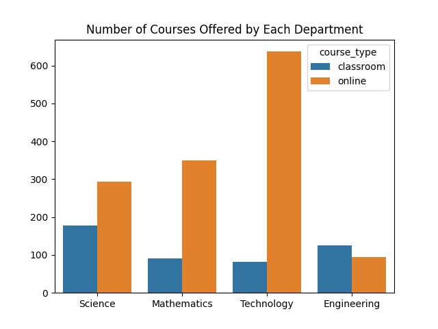
To provide an overview of the number of courses of each type, refer to the countplot shown below. Online courses are dominant for both the departments and the university. The Technology department offered the most online courses. For succeeding visualization, we shall mainly use the Seaborn package.
.info method, the data types of the features are as follows: course_type: integeryear: integerenrollment_count: stringpre_score: stringpost_score: floating-point numberpre_requirement: stringdepartment: string
post_score and pre_requirement columns have 185 and 89 missing values respectively. These values are obtained using the .isna and .sum methods. Now, we correct the data types and fill-in the missing values. The missing scores are assumed to be equal to zero (0) while the missing pre-requisitees are assumed to be empty or
'None'. Note that some values of the pre-scores are marked as a dash. We also replace these values as 0. Afterwards, the pre_score column is converted as a list of floating-point numbers, similar to the post_score, using the .astype method. Lastly, the 'Math' and 'Mathematics' values both exist in the department column. To ensure consistency, 'Math' values are replaced by 'Mathematics'. The course ID column contain unique values. This means that the number of courses is one-thousand eight hundred fifty (1850). Using the
.value_counts method, one thousand three hundred seventy-five (1375) are online while four hundred seventy-five (475) are classroom-based. To provide an overview of the number of courses of each type, refer to the countplot shown below. Online courses are dominant for both the departments and the university. The Technology department offered the most online courses. For succeeding visualization, we shall mainly use the Seaborn package.
Hypothesis Testing
Recall that we intend to compare the difference between the enrollment counts in each type of course. To start with the hypothesis testing, first observe the the distribution of the enrollment counts. Many courses attracts more than two-hundred fifty (250) enrollees. Moreover, no courses are enrolled with more than two hundred (200) or greater than two hundred twenty (220) students. Lastly, the t-test is not advised to utilize since the enrollment counts are not normally distributed.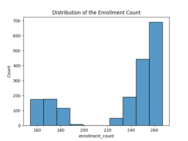
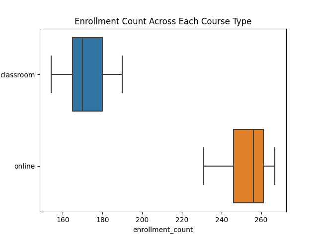
We provide more insights about the enrollment. Consider the boxplot showing the enrollment counts across the course types. Students tend to enroll more in online courses than in classroom-taught courses. The range and the median of enrollment counts for online courses are farther and greater than that of the classroom-taught courses. As a remark, no anomalies in the enrollment counts are present for both course types.
We proceed with the hypothesis testing using a Mann-Whitney U Test. This test is a non-parametric version of the t-test suitable for non-normally distributed data. For implementation in Python, the
mannwhitneyu function is imported in the scipy.stats library. By index slicing, the enrollment counts of classroom-based courses is separated from that of the online courses. We choose a significance value of 0.01 and a null hypothesis stating that there is no significant difference between the course type. A p-value of a power of negative two hundred thirty-six (-236) is obtained. Thus, the null hypothesis is rejected and say that there is a significant difference between the course type in the enrollment. Regression Model
Before choosing a regression model, we look at the correlation coefficients of the features. Highly-correlated features need to be reduced as they cause bias to the model. A heatmap showing the correlation coefficients of features are shown below.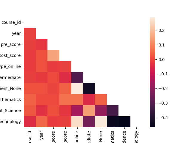
We employ a regression model to predict the enrollment count of a course offering. For a baseline model, a simple Linear Regression model is implemented using the
For feature training, the target variable
scikit-learn library. Linear regression is a good baseline model due to its simplicity and computing efficiency. It is also robust to overfitting. For a comparison model, we shall implement the Elastic Net model, which is also less prone to overfitting. In this model, the loss function puts more weight on errors is utilized. Additionally, an elastic net model is able to select important features and handle correlated features. For feature training, the target variable
enrollment_count is dropped from the set of features. The categorical variables are one-hot encoded to using the .get_dummies method of pandas. We choose the learning rate of the elastic net equal to
0.0001. After predicting the enrollment counts of a testing subset, the root mean-squared error (RMSE) on the testing set from the baseline model is 0.31489320802667325 while the RMSE for the comparison model is 0.3241052888644588. In this case, we conclude that the two models perform equally the same. Alternatively, we use the automated machine library TPOT to find a suitable model. This process may be beneficial especially when there are no time constraints in releasing a pipeline. Using the
TPOTRegressor from TPOT, the best pipeline is as follows: SelectPercentile: Keep eighty-four percent (84%) of the features based on percentile scoresStandardScaler: Standardize features by removing the mean and scaling to unit variance.Binarizer: Binarize features with 0.55 as threshold.RobustScaler: Scale features that are robust to outliers.MaxAbsScaler: Scale each feature by its maximum absolute value.LassoLarsCV: Cross-validated L1 regularization using the least-angle regression algorithm
Conclusion
Therefore, we choose any model for deployment and observing more differences once new data are obtained. Note that any model is a good choice since the predictions on the holdout set roughly off by one (1) enrollee.Machine Learning for Loan Approval: A Balancing Act Between Accuracy and Fairness
27 September 2023 (Last Updated: 4 October 2023)
(The associated codes and implementations in this project is located in the Jupyter notebook.)
Background and Objective
A start-up company wants to automate loan approvals by building a classifier to predict whether a loan will be paid back. In this situation, it is more important to accurately predict whether a loan will not be paid back rather than if a loan is paid back. Your manager will want to know how you accounted for this in training and evaluation your model. As a machine learning scientist, we need to build the classifier and prepare a report accessible to a broad audience.Executive Summary
To determine whether a loan will be paid back, we analyze the important features of a borrower, such as the credit score, the number of public derogatory records, and others. In this scenario, we provide a machine learning model for the classification. The report is divided into the following sections:- Introduction: Overview of loan repayment and factors affecting the failure of non-repayment.
- Data Preprocessing: Detailed explanation on data cleaning.
- Feature Engineering: Extract or select features to train in the classifier.
- Classifier: Model to classify loan repayments.
- Conclusion: Final remarks obtained from the model experiments.
Introduction
The repayment rate of loans is influenced by a variety of factors, including the borrower's creditworthiness, the type of loan, and the economic climate. Studies found that borrowers with higher credit scores are more likely to repay their loans on time and in full. Furthermorele, student loans are typically repaid at a lower rate than other types of loans, such as personal loans or auto loansLastinally, the economic climate can also affect the loan repayment rate. During economic downturns, borrowers may be more likely to default on their loans due to job loss or other financial difficult of defaults.Data Preprocessing
The dataset contains information mainly about the borrower, such as the credit score and the status of payment. For a complete list of features, observe the table provided below.
| Variable | Description | |
|---|---|---|
| 0 | credit_policy | 1 if the customer meets the credit underwriting criteria; 0 otherwise. |
| 1 | purpose | The purpose of the loan. |
| 2 | int_rate | The interest rate of the loan (more risky borrowers are assigned higher interest rates). |
| 3 | installment | The monthly installments owed by the borrower if the loan is funded. |
| 4 | log_annual_inc | The natural log of the self-reported annual income of the borrower. |
| 5 | dti | The debt-to-income ratio of the borrower (amount of debt divided by annual income). |
| 6 | fico | The FICO credit score of the borrower. |
| 7 | days_with_cr_line | The number of days the borrower has had a credit line. |
| 8 | revol_bal | The borrower's revolving balance (amount unpaid at the end of the credit card billing cycle). |
| 9 | revol_util | The borrower's revolving line utilization rate (the amount of the credit line used relative to total credit available). |
| 10 | inq_last_6mths | The borrower's number of inquiries by creditors in the last 6 months. |
| 11 | delinq_2yrs | The number of times the borrower had been 30+ days past due on a payment in the past 2 years. |
| 12 | pub_rec | The borrower's number of derogatory public records. |
| 13 | not_fully_paid | 1 if the loan is not fully paid; 0 otherwise. |
Source of dataset.
Using the
For the categorical variable purpose, a one-hot encoding is applied to create a binary matrix.
.info method, the data has no null values and the features are set to the appropriate data type. Moreover, the purpose column needs no improvement as it contains unique and justified values. For the classifier, the target variable is the not.fully.paid feature. Note that there is class imbalance as there are fewer examples of loans not fully paid. Specifically, eight thousand forty-five (8045) are fully paid while one thousand five hundred thirty-three (1533) are not. This is important to note since machine learning classifiers tend to underperform when class imbalance exists. Feature Engineering
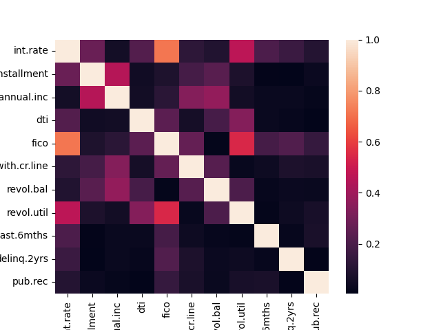
The heatmap of the correlation matrix between the numeric features are shown below. It is shown that FICO credit score and the interest rate are highly correlated. This is justified since FICO credit scoreare used by lenders to determine thes interest rate on loan. We opt to retain the weak to moderately correlated features. It is also possible that the features are too many. The classifier must also be fitted on a training data with a lower dimension. Dimensionality reduction is implemented using the Principal Component Analysis (PCA). By reducing the dimension to two (2), the features explains 99.9% of the variance.For the categorical variable purpose, a one-hot encoding is applied to create a binary matrix.

Classifier
We use an extreme grandient-boosted (XGBoost) tree classifier for this situation. A gradient boosted tree classifier utiilizes an ensemble of decision trees to make predictions. In addition, XGBoost is a specific implementation of a gradient boosted tree classifier that is popular due to its speed, scalibility, and accuracy. Note that the manager wants to accurately predict if a loan will not be paid back. Since1 is the value for a loan not getting paid back, the recall score is the metric that the manager prefers to see. For this model, the recall on the testing set is 10% which means that the model has a high accuracy on determining loans that will not be paid back. When the model is trained on a data whose dimension is reduced using PCA, the recall drops significantly. Hence, PCA does not help in this case. "pipieline found is also a gradient-boosted tree classification model applied on the features scaled on a particular range. Looking at the recall scores when the pipeline is fitted on the original, the recall scores are 100% and 10% on the training and the testing sets respectively. This is clearly a case of underfitting. Now, applying the pipeline on the synthetically-balanced data, the recall scores are 100% and 86% on the training and the testing sets respectively. Again, the model performs better on the balanced data than on the original data.
Conclusion
In this case, due to running time and near recall scores on training and testing sets, the XGBoost Classifier is a good choice for finding loan application that will not be paid back due to its high score.Bike Sharing Demand in South Korea
20 September 2023
(The associated codes in this project is located in the Jupyter notebook.) The dataset consists of the number of public bikes rented in Seoul's bike sharing system at each hour. It also includes information about the weather and the time, such as whether it was a public holiday.
For data preprocessing, the column names of the dataset needs renaming as some are lengthy. For instance, the 'Dew point temperature(C)' column name is renamed as 'Dew Temp' and the 'Solar Radiation (MJ/m2)' column name is renamed as 'Solar Rad'. The dataset contains no missing values with six columns of floating point numbers, four columns of signed 64-bit integers, and four columns of string datatypes.
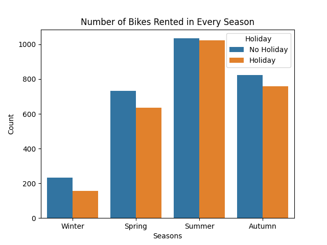
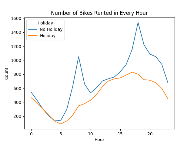
Observe the barplot shown below. Summer is the season where most bikes are rented. Also, a non-holiday has a slightly better number of rented bikes compared to a holiday. The same observation holds for if the hours are considered instead of seasons. In this setting, bikes rented are high during the late afternoon to early evening hours than any other time window.


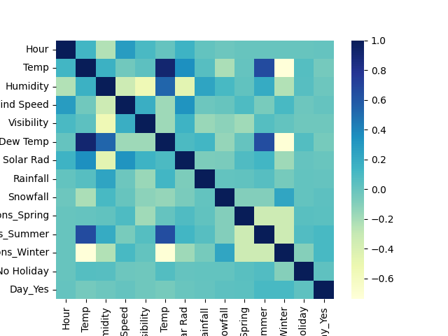
Temperature and dew point temperatures are the highly correlated features in the dataset. A principal component analysis helps mitigate correlation. Note that decision tree-based models are immune to multicollinearity.

Now, we proceed to the machine learning (ML) model. ML requires numerical values for training a model. One-hot encoding is a way to turn variables from categorical into numerical. We use a decision tree to predict the number of bikes rented. The coefficient of determination score is 0.79. We also utilize a model made up of multiple decision trees. This model is called a Random Forest model. The coefficient of determination score is slightly better than the previous model. For predictions, we can use this model instead. The model considers the hour and the temperature a person rents a bike as important predictors. On the other hand, the amount of snowfall is considered the least important.
Source of dataset. Citations:
- Sathishkumar V E, Jangwoo Park, and Yongyun Cho. 'Using data mining techniques for bike sharing demand prediction in metropolitan city.' Computer Communications, Vol.153, pp.353-366, March, 2020
- Sathishkumar V E and Yongyun Cho. 'A rule-based model for Seoul Bike sharing demand prediction using weather data' European Journal of Remote Sensing, pp. 1-18, Feb, 2020
Disaster Learning of a Machine Learning Model
15 September 2023 (Last Updated: 22 September 2023)
(The associated codes and implementations in this project is located in the Jupyter notebook.)
Ahoy! Kaggle is hosting a titanic machine learning competition where the goal is to classify whether a passenger survives or not.
For each passenger, the features include the following:
- Ticket class
pclass:1= 1st,2= 2nd,3= 3rd - Sex
sex - Age in years
Age - Number of siblings or spouses aboard
sibsp - Number of parents or children aboard
parch - Ticket Number
ticket - Fare
fare - Cabin Number
cabin - Port of Embarkation
embarked:C= Cherbourg,Q= Queenstown,S= Southampton - Passenger ID
PassengerId - Passenger Name
name
To start with the classification, we preprocess the dataset. We drop the
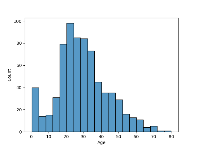
PassengerId, the ticket, and the name columns as they contain unique values. We replace the male value to 0 and the female value to 1 in the sex column to contain numerical values. Observe that the columns age, cabin, and embarked are the columns with missing values. By setting a threshold of 30% for dropping features, we drop the cabin column. The mode is used to impute the categorical feature embarked, while the mean is used for the numerical feature age. In this case, mean imputation is justified since the ages are not highly skewed, as shown in the histogram below. Lastly, a one-hot encoder is implemented on the categorical variables pclass and embarked for training purposes. 
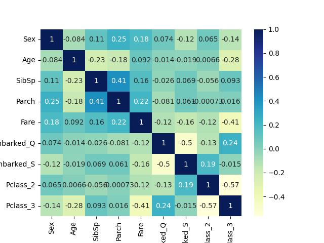
None of the features are highly correlated to each other, as presented in the correlation heatmap below. However, the ages and the fares have high variances. Hence, we standardize those features by removing the mean and scaling to the unit variance. Next, we split the data where 75% comprises the training data. Now, we are ready for model training.

We choose among the logistic regression, the k-nearest neighbors (KNN), and the gradient-boosted decision tree (GBDT) models for binary classification. Note that decision trees are usually insensitive to scaling. This means that we can use the scaled data for fitting across all models. Logistic regression are intended for linear solutions while KNN are intended for non-linear solutions. All the models with default hyperparameters give an accuracy of around 75%. To improve the models, we employ stratified k-fold cross-validation and a randomized search cross-validation for hyperparameter tuning. Both the logistic regression and the KNN models produce an accuracy close to 85% while the GBDT model produce an accuracy of 88%. Although this is a slight advantage to the other models, we choose the GBDT model for the predictions.
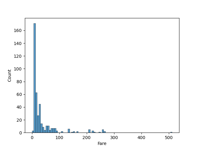
The data for prediction has the same features. We preprocess the data similar to the previous data. However, in this case, the
fare column has a null value. For this feature, we impute with the median since the data is right-skewed, as shown in the histogram below. Afterwards, the similar steps follow until the fitting of data into the chosen model. We predict the survivability of the passengers and save the results as a comma-separated values (CSV) file for submission. Upon submisison, Kaggle reveals that the predictions are 77.2% accurate. 
We also utilized the automated marchine learning package TPOT. This package enables one to find an ML model that works well for the cleaned data. In this case, we use it to find a non-deep learning model. After execution, the best pipeline found is also an GBDT model with Gini impurity for splitting the nodes. The predictions are different from the previously generated predictions but has the same accuracy score.
XGBClassifier(ZeroCount(SelectFwe(DecisionTreeClassifier(input_matrix, criterion=gini, max_depth=5, min_samples_leaf=4, min_samples_split=9), alpha=0.007)), learning_rate=0.5, max_depth=5, min_child_weight=16, n_estimators=100, n_jobs=1, subsample=0.7000000000000001, verbosity=0) DASHBOARDS
Listen to the Sound of a Dashboard (Spotify 2023)
16 September 2023 (Last Updated: 18 September 2023)
(The associated codes and implementations in this project is located in the Jupyter notebook and Power BI eXchange file.)
For this project, we use the dataset found in Kaggle presenting the most streamed songs in the year 2023. We showcase some SQL and Power BI skills for personal purposes. First, the data is imported in Microsoft SQL Server Management Studio. The total number of tracks is nine-hundred fifty-three (953) with six-hundred fourty five (645) distinct artists or groups of artists.
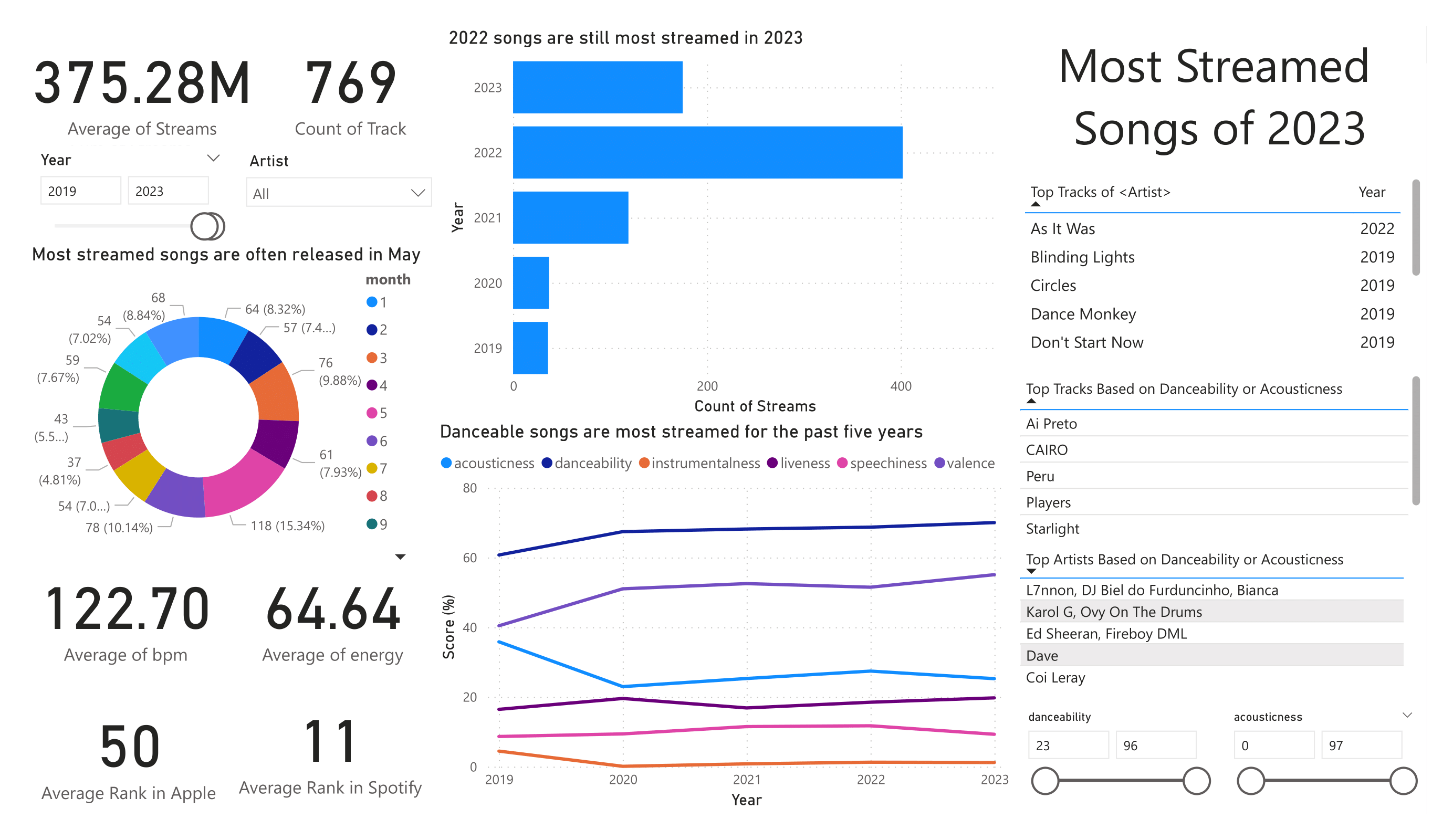

Most of the tracks, specifically four-hundred two (402), are songs released in the year two thousand and twenty two (2022). In terms of age, the oldest track is Agudo Magico 3 by Stryx, utku INC, and Thezth released in 1930. On the other hand, the latest track is Seven by Jung Kook featuring Latto released on 14 July 2023. In terms of the number of tracks, Taylor Swift has the highest numbers of songs in the dataset with thirty-four (34) songs followed by The Weekend with twenty-two (22) songs.
Now, we examine the songs for the past five years. There are seven hundred sixty-nine (769) tracks mostly comprised of tracks released in 2022. In this five-year window, the tracks 'As It Was' and 'Blinding Lights' by the Weekend, are the two of the top ten songs in terms of the number of streams. Non-instrumental songs with a high danceability factor are the most streamed are preferred by listeners. The average beats per minute (bpm) is approaximately one hundred twenty-two (122), which is near the perfect tempo considered to be a hit, according to some songwriters. Lastly, as a fun observation that needs to be experimented, about fifteen percent (15%) of the songs are released in May.

WEB SCRAPING
Scrape the Malt Extract from Your Beer
22 AUGUST 2023
In this project, we scrape data from the beer section of the Boozy website using the Beautiful Soup library in Python. Specifically, for each product in the said section, we extract the following:
- Name
- Price
- Star Rating
- Number of Reviews
A screenshot of the first page in the beer section of the website is shown below.

The program for data scraping is shown in the Python file named scraper. In this implementation, we construct a Pandas dataframe where names are stored as string, prices and ratings as floating point numbers, and number of reviews as integers. In the following figure, we see the first five observations. Prices are in Philippines pesos while ratings are on an integer scale of 1 to 5 where 1 is the lowest and 5 is the highest.
| Name | Price | Rating | No. of Reviews |
|---|---|---|---|
| Engkanto Mango Nation - Hazy IPA 330mL Bottle ... | 543.0 | 5.0 | 2 |
| Engkanto High Hive - Honey Ale 330mL Bottle 4-... | 407.0 | 4.0 | 5 |
| Engkanto Green Lava - Double IPA 330mL Bottle ... | 594.0 | 5.0 | 1 |
| Engkanto Live It Up! Lager 330mL Bottle 4-Pack | 407.0 | 5.0 | 1 |
| Engkanto Paint Me Purple - Ube Lager 330mL Bot... | 543.0 | 5 | 1 |
As a web scraping project, we focused less on producing data mainly used for data analysis. However, we can provide some information about the products. We start by considering the prices. The cheapest beer products priced at 60 pesos are the 330 mL bottled and the 330mL canned versions of Tiger Crystal. On the other hand, the most expensive beer product is the Stella Artois 330mL Bottle Bundle of 24 priced at 3576 pesos. Next, we consider the ratings. The five beer products with the highest number of reviews are shown in the following table. The number of reviews is also indicated in the table.
| Name | Reviews |
|---|---|
| Heineken 330mL 6-Pack | 99 |
| Crazy Carabao Variety Pack #1 | 42 |
| Hoegaarden Rosee 750mL | 41 |
| San Miguel Pale Pilsen 330mL Can 6-Pack | 33 |
| Crazy Carabao IPA 330mL Bottle 6-Pack | 31 |
Now, we consider the star ratings. There are 77 products with a star rating of 5. We can filter this data further by including the number of reviews. The four highest-rated beer products with at least 5 reviews are presented in the following table, including their rating and number of reviews.
| Name | Rating | Reviews |
|---|---|---|
| Pilsner Urquell 330mL Bottle Pack of 6 | 5.0 | 12 |
| Sapporo 330mL Bundle of 6 | 5.0 | 12 |
| Stella Artois 330mL Bottle Bundle of 6 | 5.0 | 11 |
| Paulaner Weissbier Dunkel 500mL Bottle | 5.0 | 11 |
Moreover, the four lowest-rated beer products are shown in the following table.
| Name | Rating | Reviews |
|---|---|---|
| Rochefort 8 330mL | 3.0 | 1 |
| Royal Dutch Ultra Strong 14% 500mL | 3.5 | 2 |
| Tiger Crystal 330mL Can | 3.8 | 5 |
| Paulaner Weissbier Party Keg 5L | 3.8 | 5 |
CC BY-SA 4.0 Septimia Zenobia. Last modified: October 02, 2025. Website built with Franklin.jl and the Julia programming language.